Monday, 29 December 2014

Ancillary: pitch

Planning ancillary: Location

Planning ancillary: Costume

Wednesday, 24 December 2014

Ancillary Product: Pitch

Album Cover Inspiration

Tuesday, 23 December 2014

Ancillary Product: Initial Idea

Below is my initial idea of what I want my digipak to look like...

Digipak Research

Magazine Advert Research

Do's and Don't (Ancillary Product)

Reviewing Previous Ancillary Product

For better size: http://app.emaze.com/@AOFLRCIZ/ancillary-product

Powered by emaze

PROGRESSIVE REVIEW BLOG

PROGRESS GRADE RESPONSE [2]

Monday, 22 December 2014

Final Music Video: Response


Question 3 + 4 Evaluation Notes


Friday, 19 December 2014

Pitch feedback

For my pitch my teacher said the design idea was spot on and well detailed. Very good layout and concept. Things I need to improve on.
Add label and explain why I would be signed to them.
Add a magazine and draw up a second concept of the magazine and layout.

Thursday, 18 December 2014

idea concept for the album.


My album cover theme is quite dark but thats just to set the theme. This picture is from chance the rappers song. But it has the Black theme with the kind of dark indie rock cover. Blends in with the whole leather jacket with the casual visuals.


I wanted to keep the kind of forest style location and bring it into the album/magazine covers. The whole black white style says al lot and there is less explanation to do.

Whilst looking at these images i realised that gold would be a good colour to use on top of the black and white primary colours. The whole theme of love and emotions with masks to create a connection between them.
I Thought black feathers of a crow would show a story and narrative and fit in with the whole forest theme. Not only giving the cover some more shades of black and tones of blue but also allowing me to manipulate the feathers and turn them into a mask which will be the back of album and behind the names of the songs. The name of the songs will be in white and behind it will be black. The CD disk will be feathers creating a outline around my head. Kind of being submerged 


Why 6 panels explained

I wanted to go deeper into my album cover with the 6 panels and explain why i created the whole sketched idea in more deeper detail.

The 3 panels allow me to show a flowing picture. This album cover shows a massive pile of sketches creating the effect of a story.

The genre is indie and has a story I thought having the story with lot of quotes and a lot of shots of my face would be very identifiable.


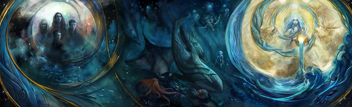
This picture is more of illustration but it shows more of the story flowing idea into more of an imaginary world/ Which is kind of something i was aiming for but with more of a natural forest feel. Dark forest with me leaning against trees was the main idea.
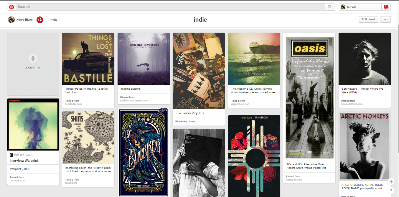
This is an indie rock group with 6 panels. Though we cannot see whats on the outside as we can see i keeps the while colour scheme what  on the front with the primary black onto the white background. It not only fits the genre  but also shows me what colours work with indie based music.  

The way the panel will open is pretty straight forward, i will also produce the CD itself using Photoshop.

Reaction to music video

Today we had the music video final show. The reviews were good and i thought that the other groups had some amazing songs especially group - placeholder- the Chance the rapper editing was on point i was kind of intimidated by the other classes work but that was mainly because they were all very good.

Wednesday, 17 December 2014

Pitch

Commuting


While on the underground today I found some cool ideas for adverts and album covers designs. I love the Eminem album cover. I have the album :D. The Script I don't listen to there music but there album cover uses good colours. The fonts are always primary colours.

Planning ancillary: Photoshop tutorial and trial

Tuesday, 16 December 2014

Meaning of art project how it links to media studies

For my Fine art project i'm currently studying manipulative lines and the way colour links with this. Because i'm very advanced in photoshop and fine art  portrait sketching i will be creating a sketched portrait from a photo i took. It wont be the one used in the mock up because i rethought my idea after looking at album covers by various artists.

I looked at multiple covers that are listed in my blog and i realised that the way the face is positioned and the pose relates to not only the genre but also the meaning of the album. This is super important for making a album that is easily recognisable but also synergies with the album itself.

I think i will be looking into creating a 6 cover album. I realise its much more easier work to do the 4 cover but i feel like i could create a lot with my basic idea that i have made and if i was to use 6 covers i could easily show all my artistic talents.

The story behind the album is how emotions mask us and thats how were represented. The mask is very basic and was used in my music video. So that i do not repeat the same thing and loose marks because of it i will instead change the way the mask appears but make sure that the mask is made of feathers and with some quotes splashed around. (text usage coming up) - Know will be using depressive quotes all over in the background but not sure if i will create my own or find very historical ones.

Black is the main colour and Le Blake is the name of the artist therefore i could create something with the name making it white and black to not only stand out but show the name of the artist.

The manipulative line project i will be looking at an artist called carne Griffith's x Gabriel Moreno kind of like in my book. I reassure you i know what i'm doing and can sketch so its all good. They use pens and water-colour not only to make outstanding pieces of work but also recognisable.
Carne griffith.


Gabrial Moreno.

advanced sketching for my album cover

Link to sketched work - with lines and project with my face- vv position

mock up


Sketch i did in class for the designing process. Take note the front cover is on the right because thats how the case will open. The ideas are from my Pintrest pins. This was in class I will redo this properly because I study art if developed things like this before so next time I do it it should look professional. 

Monday, 15 December 2014

Planning Ancillary: advertisement

Planning Ancillary: plan mockup digipak

Saturday, 13 December 2014

New ideas for album covers

In order to create my album cover I went onto Pintrest to develop ideas. I loved the tonal hue filters and some of the sketched
work. I wanted to incorporate them into my album cover.

Friday, 12 December 2014

Found advertisement

On my way back from home, I noticed the scripts advertisement on the tube station. I took a picture to overlook at the linkings to their album cover and advertisement to make it similar to our actual digipak and advertisement.

Thursday, 11 December 2014

Research indie rock~

Powered by emaze

Wednesday, 10 December 2014

Planning ancillary: Fonts, Colors, Layout and design ideas

View Short list.pptx and other presentations by a2set12014.

Research Ancillary: Magazine advertisement

Ancillary research: Magazine advertisement Research

Tuesday, 9 December 2014

Planning ancillary: Do's and Don't's of design work

Research Ancillary: Looking into students previous past digipaks

Monday, 8 December 2014

Research Ancillary: Indie rock album cover research

Research Ancillary: importance and function of digipak

Update

Quick updates:

Music video was finished on friday 5th Dec.

Starting planning and creating my digipak.

developing digipack


These are basic ideas that i have collected for my ancillary project.  I thought of using a art based image of the artist mixed with some photoshopped effects. I liked the use of brown in all the images that i chose. I will explore more of these ideas in my further work in order to draw a conclusion to my research.

Getting ideas


Analysis and three advertisements


This was a past year students work. I loved how the face was clearly lit up by the camera and how the forest effect was provident throughout. Only thing i did not like was the text on the inside of the cd cover it felt unreadable.

Bastilles album is nice and shows the red on black effect which is very basic but works well. I like the way the vinyl Cd disk is crimson red. This shows me that i can make the Cd interesting aswell.

This pixilated effect is seen throughout. The meaning of the title is that you can see other peoples heartache through a tv.

This is on there album on a TV i thought was a cool way to represent there album with a pixilated grainy effect.

Tech N9ne one of my favourite rap artists shows off how he presents his albums that are coming out. I like the way the disk is red and the cover is black that effect works well in almost any genre. Note how he uses the in stores and there trademark logo.


Imagine dragons used the clouds to give a real nice effect of mist. I love there use of location and is something I want to incorporate into my product.


Saturday, 6 December 2014

Music Video: Production Schedule Change

In the pitch, I have outlined that we will be filming for three days. However, due to our availability, we had to postpone the days, making it a total six days of filming.

Original Production Schedule:


Production: Progress Review blog

Friday, 5 December 2014

Music Video Theory

Music Video: Concept Change

After filming and editing, I have realised the concept of our music idea has changed and is different from what I have presented in the pitch.

Originally it was:


Now it is:

Skills Development: Editing

Evidence of Editing

Below is a video of me editing on Thursday 20th November 2014

Rough Draft 2 Response

Interviewing Artist: Nawd

Improvement in Filming

Although we finished filming a month ago, I decided to do a blog to show how I have improved in terms of my camera work.

Filming Day Six Review

FILMING Day Five Review

Production: Evaluation question 4

Thursday, 4 December 2014

Music Video (Theory Analysis)

Extra Blog: Artist Who Break Stereotype

Extra Blog: Bastille Music Video Analysis

Notes for Evaluation Question One

FINISHED! ;D

Production: notes for evaluation 3


Audio and voice recording >>

FINAL MUSIC VIDEO

02. Thaomy, Tahmina, Nawd from 283goswell on Vimeo.

teaser trailer

Blog Update: Production: Skills Development

I decided to re-blog this as it originally was a written post and because the part of the blog work is marked on ICT skills, I wanted to present it through PowToon.

Wednesday, 3 December 2014

Blogger health checkup update

Received feedback on my blog which was very good grade went up slightly meaning im going in the right direction. Need more blogs to be done and starting the advertising soon so il have more work to do. *Update on music video. 90% done just needs colour correction and some more discussion and we will be finished* almost finished first segment. of the course.

FILMING Day Four Review


Monday, 1 December 2014

TOP SECRET : just a few shots of me

coming soon - video in class

Production: Editing colour correction

Final Cut Pro: Editing Widescreen

One of the special effects we wanted to use in our music video was a wide screen making it appear to be an actual music video. In order to do this, we looked at a YouTube Tutorial for this.
But after discussing with the group, we decided it would not look good in terms of the framing of our shot.

Happiness with blog in correlation with targets

Production skill development


Skills development: @quicknote